After several new features that involved additional functionality, we decided to make some graphical changes to the dashboard and publications area.
The changes are both graphical but mostly in terms of usability: the intent is, as always, to make the platform more and more intuitive and easy to use.
And as with all our new features, the suggestions come directly from your valuable feedback, for which we are very grateful.
But let’s get right to the new features!
The new dashboard
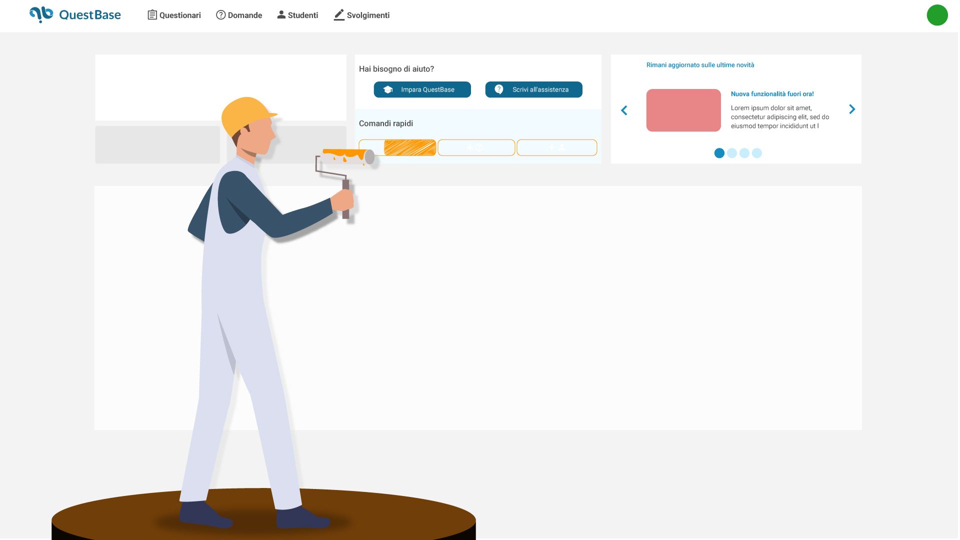
The dashboard is the first section you usually see after logging in, which is why we decided to make it more comprehensive.
Look at the comparison of before and after:


Let’s go through the changes and new features in detail:

- In the upper left-hand corner you will find a brief summary of the active license type and expiration date. License purchase or renewal buttons and the Premium Code button will always be visible, in case your institution or company has purchased a multiple license package.
But where have the license counters gone?
They haven’t disappeared! We just moved them to the drop-down menu in your profile picture:
It’ll open this popup window:

- The notifications and contacts to manage have only been moved and now you can find them in the lower left part of the dashboard.
- We decided to include two quick buttons that are very useful in case you need them: the Learn QuestBase button refers you to the support section on our site. Didn’t find the answer you were looking for in the support section? Don’t worry: with the Contact Us button you can write a direct email to our support team.
- The quick commands for creating an assessment, creating a question, and creating a student have been centralized and made more visible. We have also changed the color of the buttons within the respective sections, go take a look!
- Finally, we thought we’d dedicate the last part of the dashboard to the latest news we post here on the blog, so you can stay up-to-date on what’s new (like this, after all!)
The new publications area
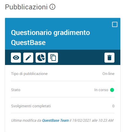
Regarding this section, the reason for the redesign was mainly inherent to usability.
In fact, many of you, especially during the first logins in the platform, could not easily find the link to distribute the publication. Therefore, we decided to make everything much more explicit.
Take a look at the before and after:


Now for all online publications, the pin and link to the publication is already visible from the assessment page. By clicking on the copy button, you can easily copy the link to your clipboard and forward it to your users.

Let us know if you like these changes and especially if they seem useful! Write to us by clicking on the button below:


